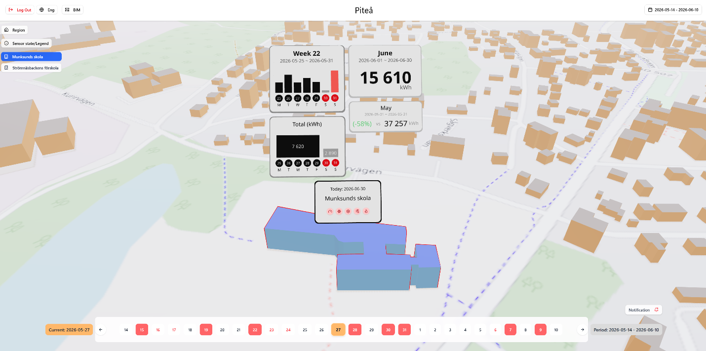
In the ESUDA project, a web browser-based dashboard is available to authorized users to view sensor data and related information on PCs and mobile devices (e.g., smartphones and tablet PCs). Figure 1 shows one of the available UI options: a map-based data visualization in the dashboard.
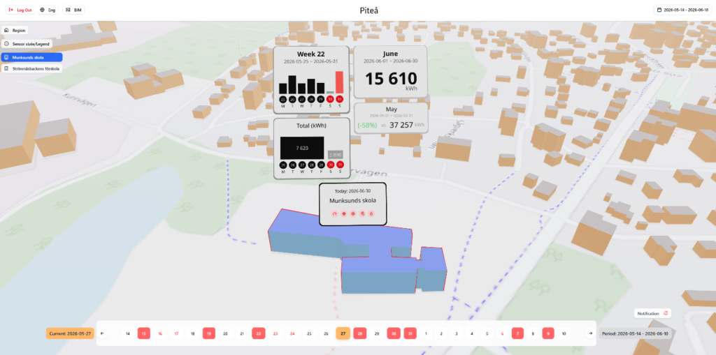
The dashboard is implemented with MQTT and a RESTful API to fetch sensor data from a data server, React.js and three.js to render 3D maps and buildings alongside sensor data, and Firebase to host the dashboard app online. Figure 2 illustrates the structure of the dashboard.
The dashboard consists of four pages: the login page, region selection page, map, and the BIM-based data visualization pages. Figure 3 depicts the dashboard flowchart.
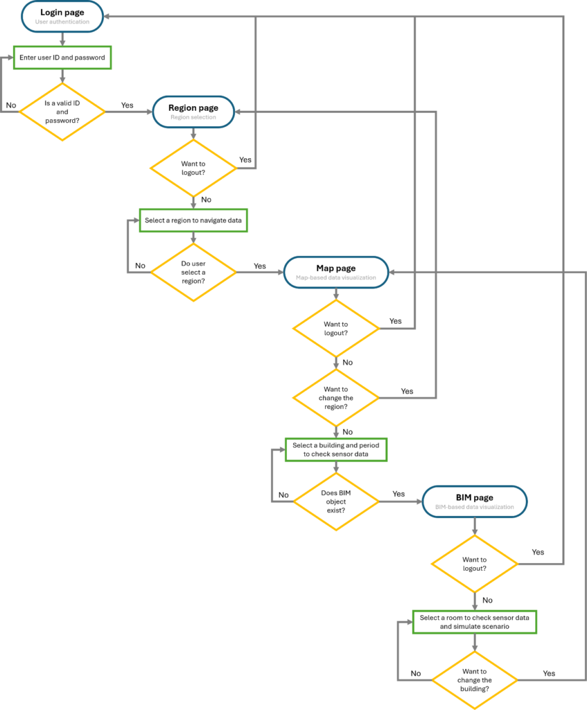
On the login page, users must verify their ID to access the dashboard. While Firebase helps host the dashboard, it also supports authenticating users with ID and password. Once verification is complete, users can select a region to find a building with sensor data they are interested in. Only authorized users can choose a region, so users without permission in other regions are prevented from accessing them.
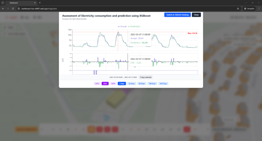
When users select a region, the map-based page is displayed. Users can navigate freely between pages (BIM-based data visualization page). They can configure the setup (e.g., date, building, and room) to check the latest sensor data and additional information calculated based on the historical sensor data, such as monthly energy consumption of a building, comparison of energy consumption of a building between the current and previous month, weekly energy consumption of a building, and daily energy consumption changes in bar charts. Users can view more details of the sensor data, illustrated in a time-series graph (e.g., data are collected every 5 minutes). Figure 4 presents the time-series graph of the differences between a building’s predicted energy consumption and its actual energy consumption history.
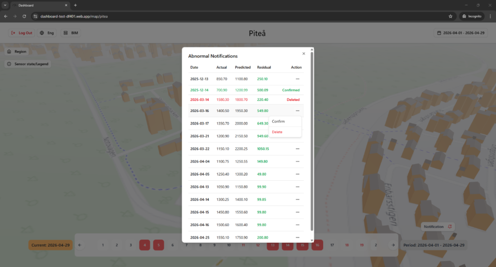
In addition, users are informed regarding anomalies in sensor data (Figure 5). Users can confirm whether the anomaly notification is a true positive or a false positive. This reply information would be used to improve the anomaly detection model’s accuracy.
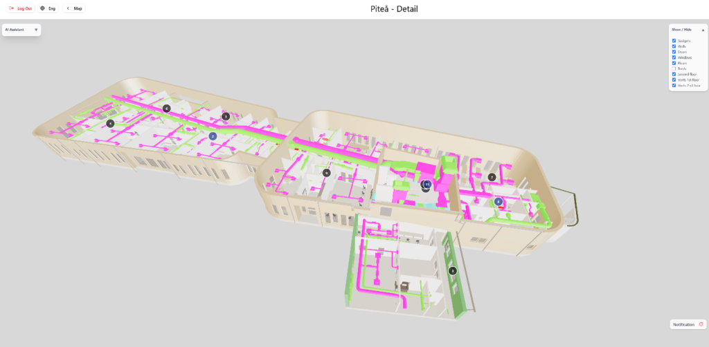
Users can choose a building to inspect data per room. The BIM-based data visualization page is designed for this purpose, where users can check data for each room and the influence of environmental conditions between rooms for a specific scenario. Figure 6 illustrates one of the BIM objects that contains all the rooms and the infrastructure of the energy management system inside the building (e.g., electrical lines and ventilation pipelines). Users can manipulate the models and check sensor data for a room by clicking the hotspots (i.e., the number buttons).
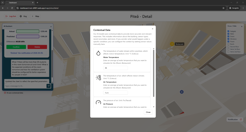
In addition, users can interact with an AI model to ask about room conditions and related information (Figure 7).
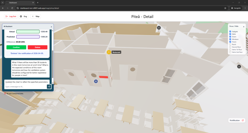
Moreover, users can simulate a scenario of a room/building scenario by configuring contextual data (Figure 8). By setting values, users can get answers regarding their imaginary scenario (e.g., what should be the ventilation speed for tomorrow if there will be more than 50 people in the restaurant room?) from the AI model.